Function vs. Design is a classic topic that most companies and teams must work through – designers strive to create a canvas while marketers must adhere to what converts and ultimately drives revenue. A classic example can be found in the early 2000’s – while flash allowed designers to produce amazing and awe inspiring creative designs, in many cases the images were not SEO friendly – leading to higher bounce rates and lower conversions. As time progressed and familiarity with these methods grew, new techniques and strategies emerged producing a more interactive and optimized user experience.
Is Simple the new black?
As Facebook recently announced – the company is making efforts to simplify its ad products and provide a more objective focused advertising model. By trimming the complexities of onboarding and optimization, Facebook is positioning itself to appeal to large and small businesses alike – providing a truly interactive environment for these brands to build creative that promotes engagement with their personal communities.
Creative best practices should always focus on the importance of producing ads and copy that not only piques the interest of a brand’s target audience but also encourages them to interact and complete an action. This is clearly evident when looking at Facebook’s mobile app install ads. During a recent campaign, we saw an 8% lower CPA utilizing custom creatives and managing separate campaigns to leverage the full breadth of Facebook’s unique targeting capabilities.
Creativity clearly matters regardless of whether a brand is targeting their audience within a desktop environment or on a mobile device – so we’ve put together this additional list of tips and guidelines to help guide your efforts.
1. Take advantage of Facebook’s large ad formats
The standard size of ads in Facebook’s right-hand column are only 110x80px and while these ads remain effective, the size constraints are far from ideal in a creative workspace. Fortunately, Facebook offers a couple of different large ad formats available for desktop and mobile newsfeed delivery. For example, photo page posts are displayed at a resolution of 400×300 px on a desktop, which is considerably larger than the ads in the right hand side. Additionally, the newsfeed is considered the primary focus for most users on Facebook and by placing your ads here you are more likely to garner the attention of your targeted demographic.

2. Express context through consumer devices
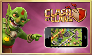
Expressing context is incredibly important with mobile app install ads, which allows marketers to direct users to interstitial app installation pages on their smartphone. While these ad formats support “install now” buttons, it may not be clear to some users that these ads are actually directing them to install applications on their device. By showing the device in the advertisement, the clarity of the intended action becomes instantly recognizable and leads to a more qualified app installation and user.

3. Test varying creative approaches within each campaign
A methodology we have had success with in the past focuses on testing varying creative approaches within individual campaigns. We’ve seen different degrees of success and a few surprises in some cases when testing creative components. While all of the best practices included in this piece are designed to provide insight into the creation of a successful ad, there’s no way to absolutely guarantee that certain techniques work all the time. If we note that one approach works over another, we can redirect design resources to producing more content based on successful images.
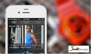
Screenshot of app / device vs simple product shots
4. Try to avoid obvious stock photos
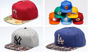
In certain situations, adding an amateur element to ad creative can help to make it seem more authentic, especially in campaigns for social products. Stock photos have become so prevalent that even users who doesn’t necessarily know what a stock photo is understand that what they are seeing is artificially constructed and may negatively impact user perception.
Amateur-looking photo vs obvious stock photo
5. Be explicit with your call-to-actions
Make it easy for users to understand what exactly is being promoted in the ad through visual call-to-actions that explicitly convey your message. Citing that something is free or alluding to a bonus of some sort are simple ways of grabbing user attention and increasing click-through-rates.

6. “Play Free” call-to-action
Granted not all “best practices” will work every time. The key component of any successful campaign is to test, optimize and then test again – we are always striving to exceed our partners goals and objectives. Our creative teams provide image support as a part of AdParlor’s full service solution- we work collaboratively with our partners, providing a consultative approach that has proven to be successful time and time again. Contact us today to learn how we can work with you to ensure your creative is generating the highest level of engagement with your targeted audience.


